Leveraging product design in StorQuest’s creative website redesign

Location

San Diego

Timeline

June 2024—1 month

Role

Red Door UI/UX Intern

Team

THE STORY

StorQuest’s website redesign ask: “We don’t want a cookie-cutter website”

StorQuest is a self-storage company with 200+ locations nationwide. Their website provides tools for customers to find nearby locations, find storage options, and discover storage features.

StorQuest often mentioned that they wanted to avoid the “cookie-cutter” in client meetings. While our design system helped us build efficiently, the challenge was creating something distinctly StorQuest.

StorQuest's home page in June 2024
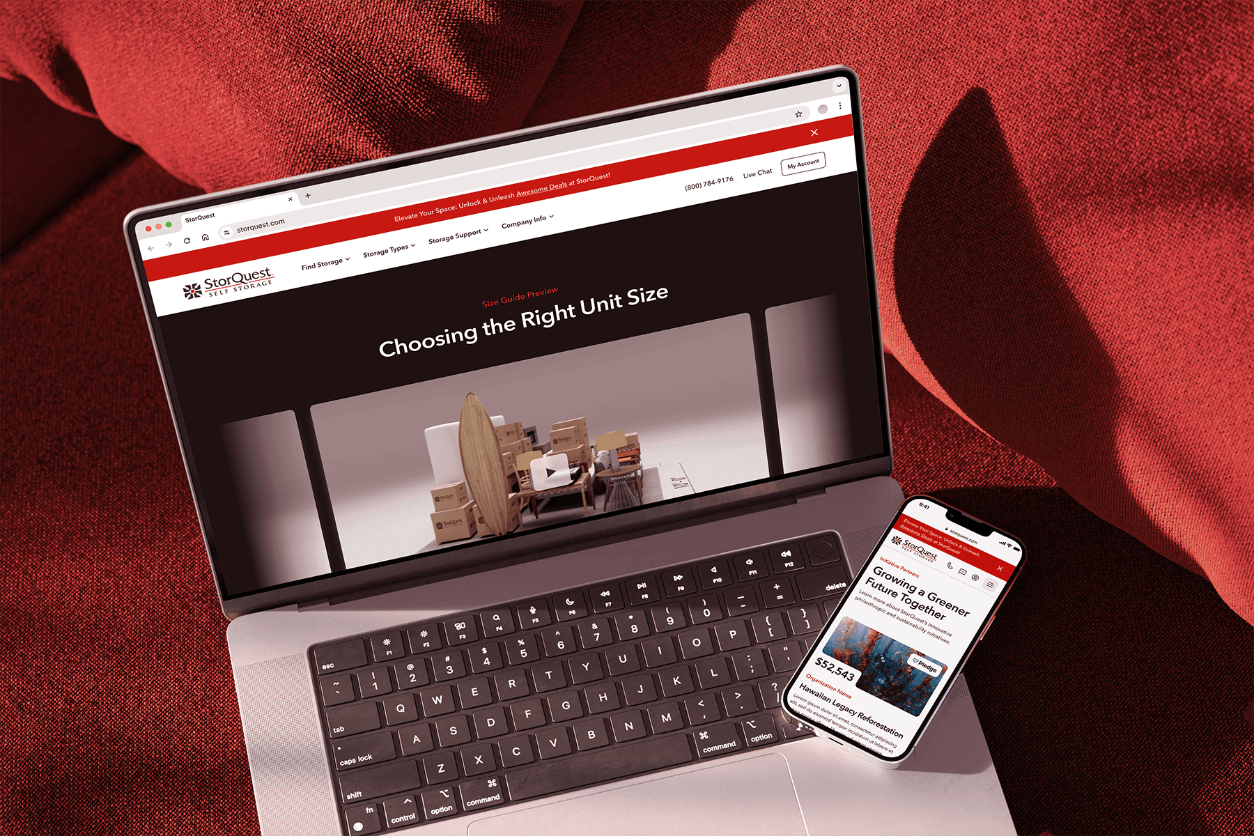
THE Solution

Immersive experiences, thoughtful interactions, and subtle flourishes.

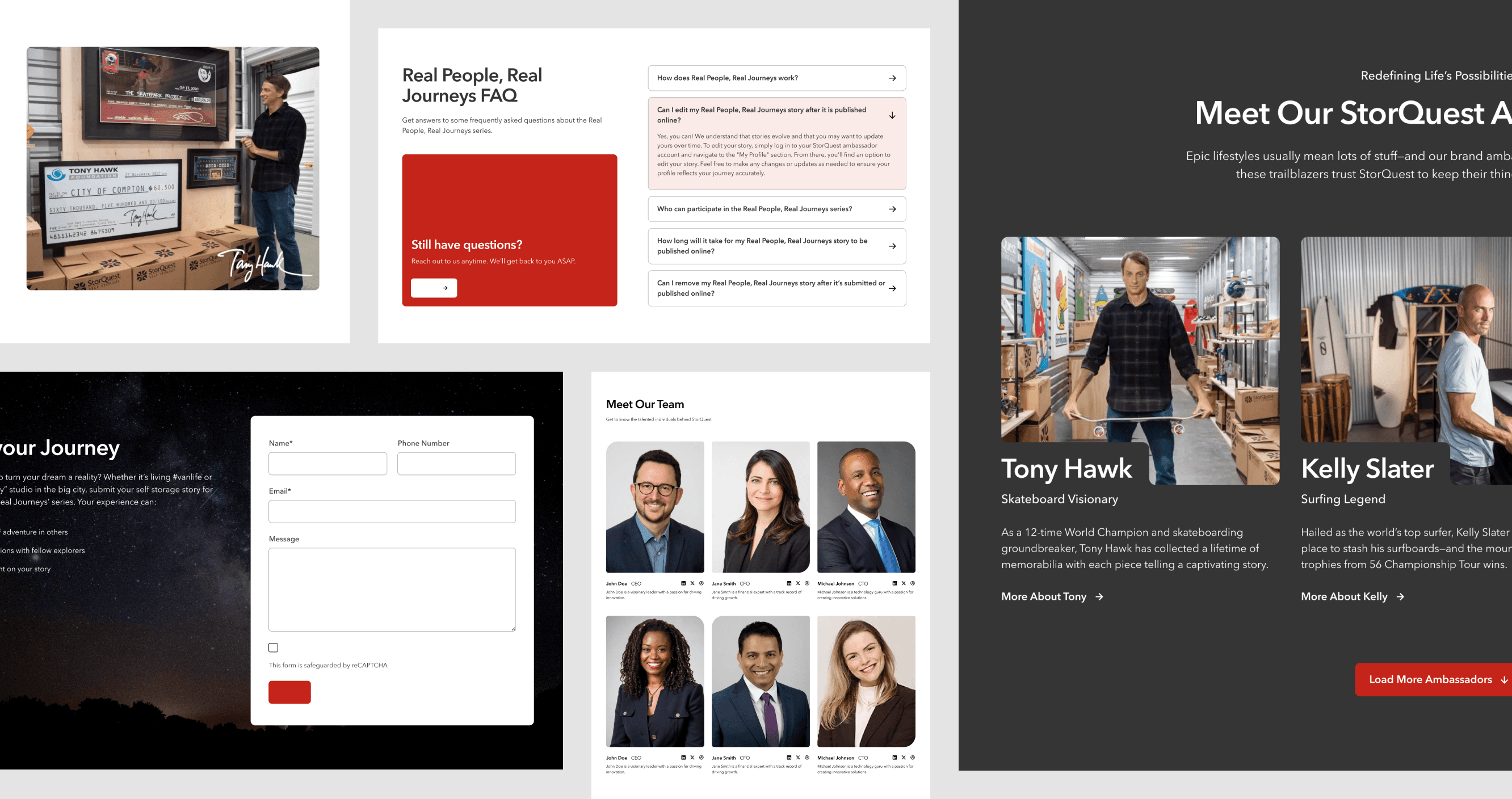
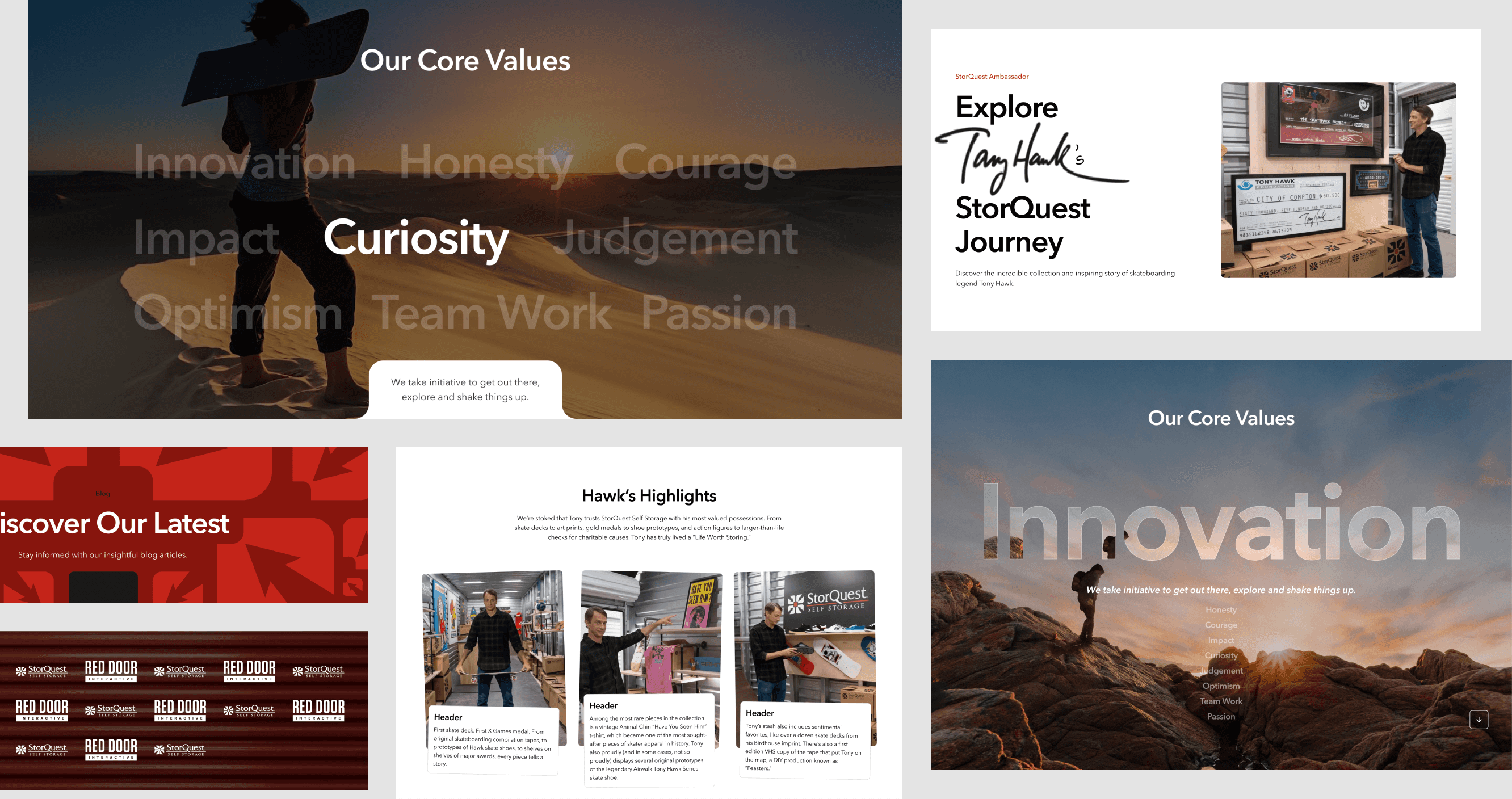
I took initiative to concept creative alternatives that would set StorQuest’s site apart. These designs were well-received by both the Red Door team and Storquest, with several making it to the final design.

Here are a couple of my alternate designs:

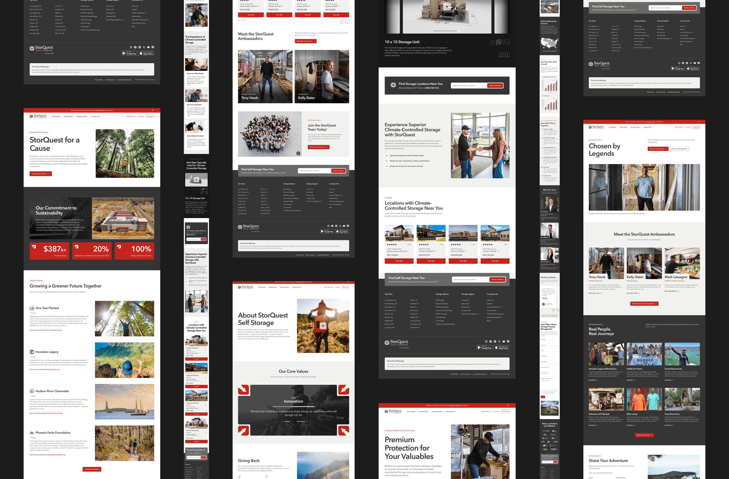
A couple of our redesigned pages:

THE OUTCOMES

Happy client and happy teams

As the redesign has yet to ship, I have no metrics to report :’(. However, I’ve been told that StorQuest was delighted by the alternative options.

The Red Door team was also thankful for the designs, which has helped us maintain good relations with StorQuest and deliver a redesign with elements they love.

"We couldn’t have gotten everything made so quickly and the design direction improved without your help @Karissa Wong! You did an excellent job taking on client work!"

Kaheawai Kaonohi, Red Door Designer

"I really want to thank @Karissa Wong, who made a massive contribution in getting us there!"

Ashton Taylor, Red Door Senior Designer

"Fantastic job team! This was a huge undertaking and I felt you guys really pushed the designs!"

Cody Leibert, Red Door StorQuest PM

My Contributions

Creative Alternatives, Responsive Wireframes, Hi-fidelity Pages

50+ alternatives

20+ wireframes, collaboratively

20+ hi-fi pages, collaboratively

That was the TLDR; continue below for details!

Process Overview

Timeline

Project Constraints

PTOs & being resourceful

During my first 121 with my manager, I asked how I could be a team player at Red Door. Candice shared a lot of valuable advice, but “Be resourceful” stuck out the most.

When my manager (CW) and senior designer (AT) left for a 2-week PTO within my first week on the project, I was resourceful. I watched client recordings, dug for briefs, and scheduled alignment calls.

Photo by cetteup on Unsplash

Work overview

11 responsive pages and 45+ sections

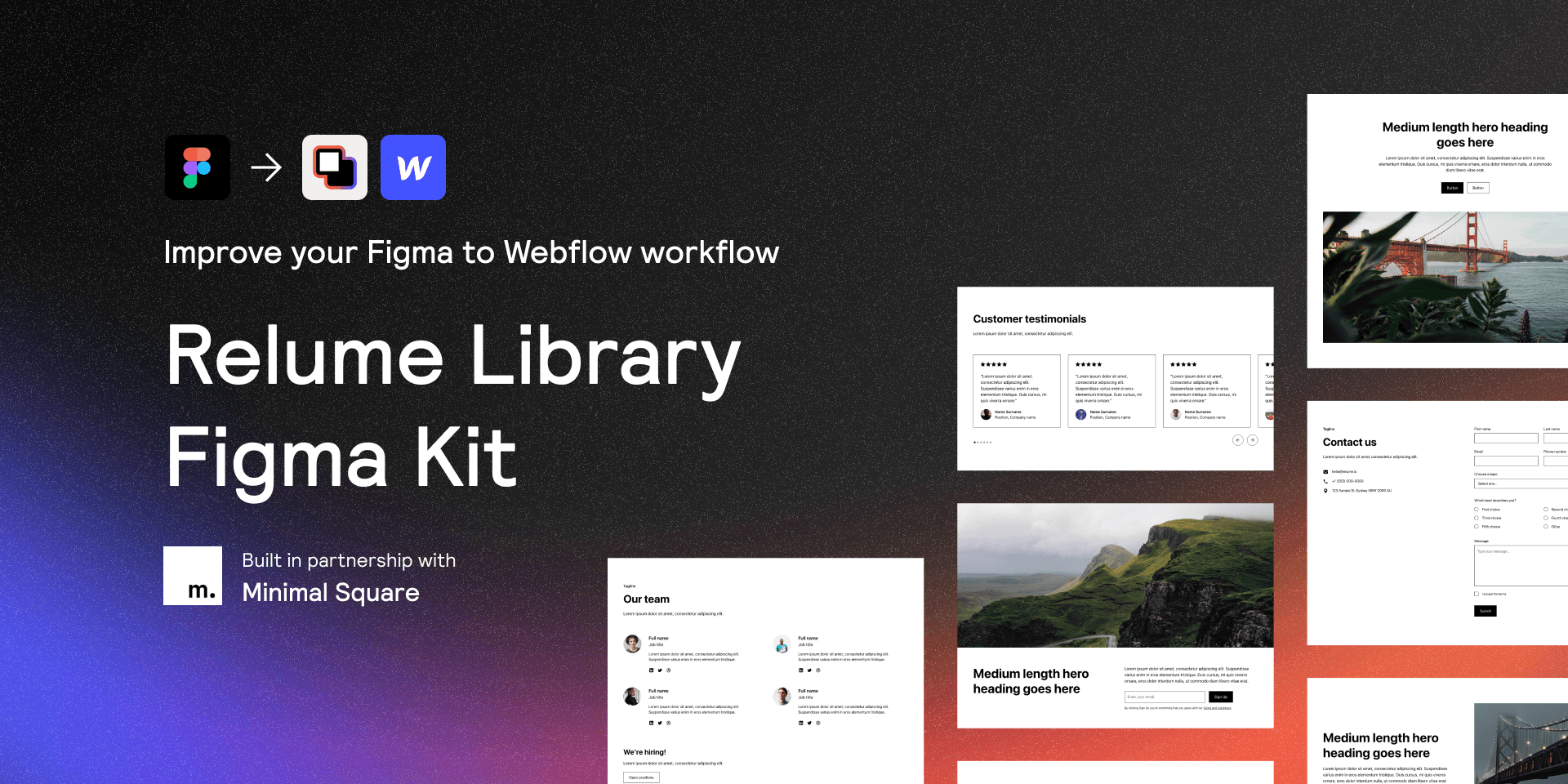
For this project, Red Door used a lean design process by building with Relume's design system and iterating via internal reviews, client feedback, and guidance from the senior designer.

The team and I used the Relume library to create responsive wireframes adhering to the StorQuest style guidelines, then iterated them into high-fidelity pages.

Opportunity on the JOb

Taking initiative to design alternatives

I heard that StorQuest had been adament about a redesign that captured their company's essence. Our current designs were professional and functional, but StorQuest wanted their branding to shine throughout the redesign.

It was both a business and design opportunity to design these alternatives—I had finished my tasks early, and creating alternatives would be valuable design experience and also provide value to our agency-client relationship.

An early version of the core values section, before StorQuest-glamification

Growth on the job

Learning to prioritize accessibility and function over aesthetics

When I first started ideating alternative hi-fis, I approached it as graphic design in an attempt to make them more customized and "not cookie-cutter."

I learned quickly that this approach failed to be cohesive with our visual system because it lacked accessibility for web readers or failed WCAG color contrast.

An early alternative that was visually engaging but terrible for the web

Here's a couple of my first alternative designs, which had layouts that were either inconsistent with our design style, difficult for dev, or had major accessibility issues.

With feedback, I started to simplify yet personalize experiences through simple interactions, like hover and scroll effects.

I also learned when to hold back on the interactions to create elegantly static designs.

Design Deep Dive

Size Guide Section

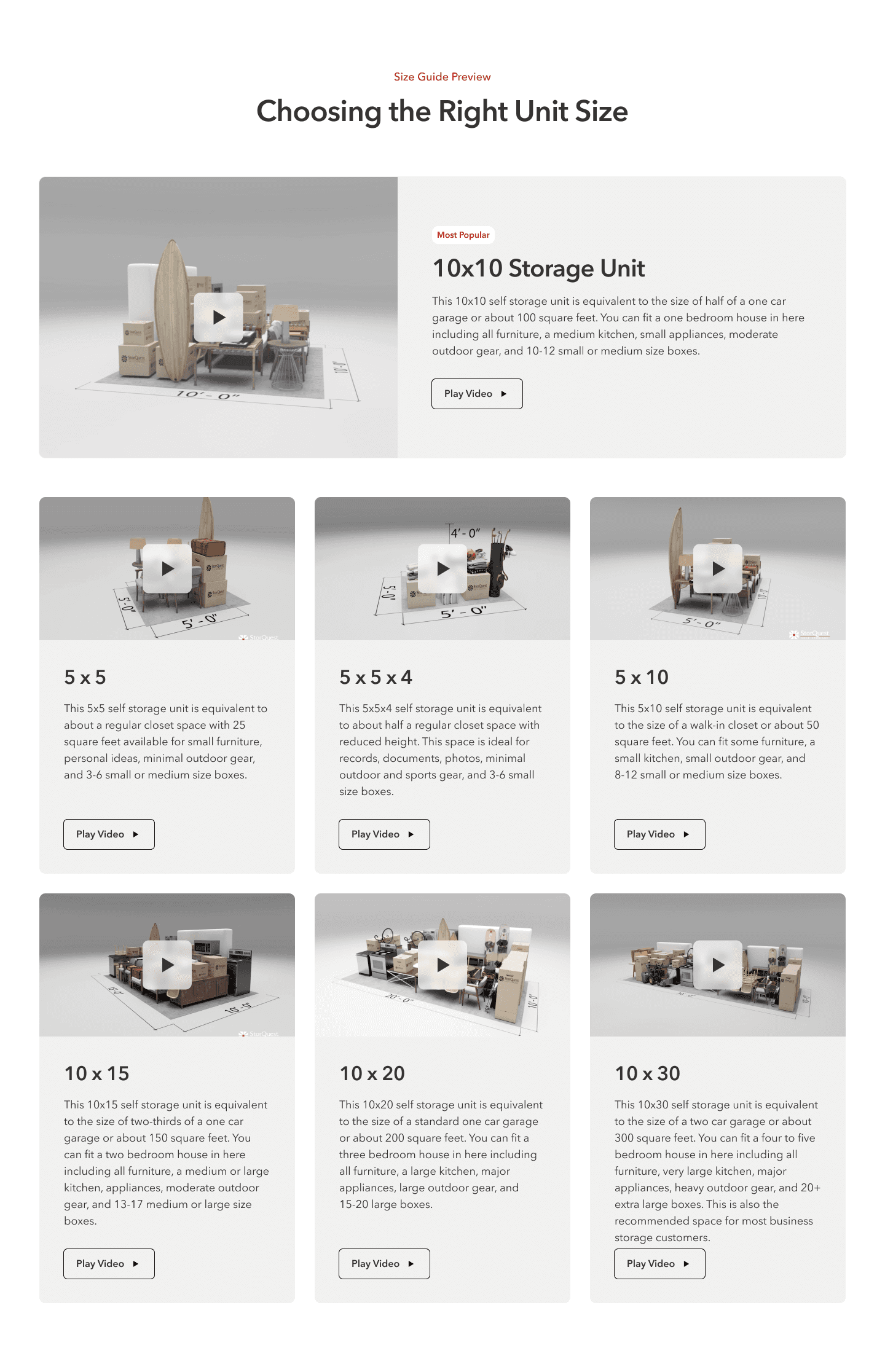
The Size guide is one of the many page sections I found opportunities for a creative redesign. Below is the original StorQuest size guide:

The business and user pain points

Doing a quick analysis of StorQuest’s Size Guide, I found issues that could drop user retention due to the UI/UX.

Poor layout and organization

This section was long and overwhelming with 7 size options at once

  • Too many videos at once, too much text

  • A lot of center alignment (not ideal for reading)

  • Difficult to compare options when scrolling back and forth

  • Immediate size organization/order is unclear

Poor hierarchy and high cognitive load

Unscannable section because of design stylings and copy

  • Unclear user flow: watch video or read text first?

  • To compare storage volume, users would have to multiply dimensions and compare sizes mathematically

  • Different font stylings compete for the same hierarchy level

Red Door's V1

Red Door's redesign was much more readable and organized, yet it still felt like an overwhelming page section because of the high density of text and videos. I saw an opportunity to put a creative spin on it!

My Redesign

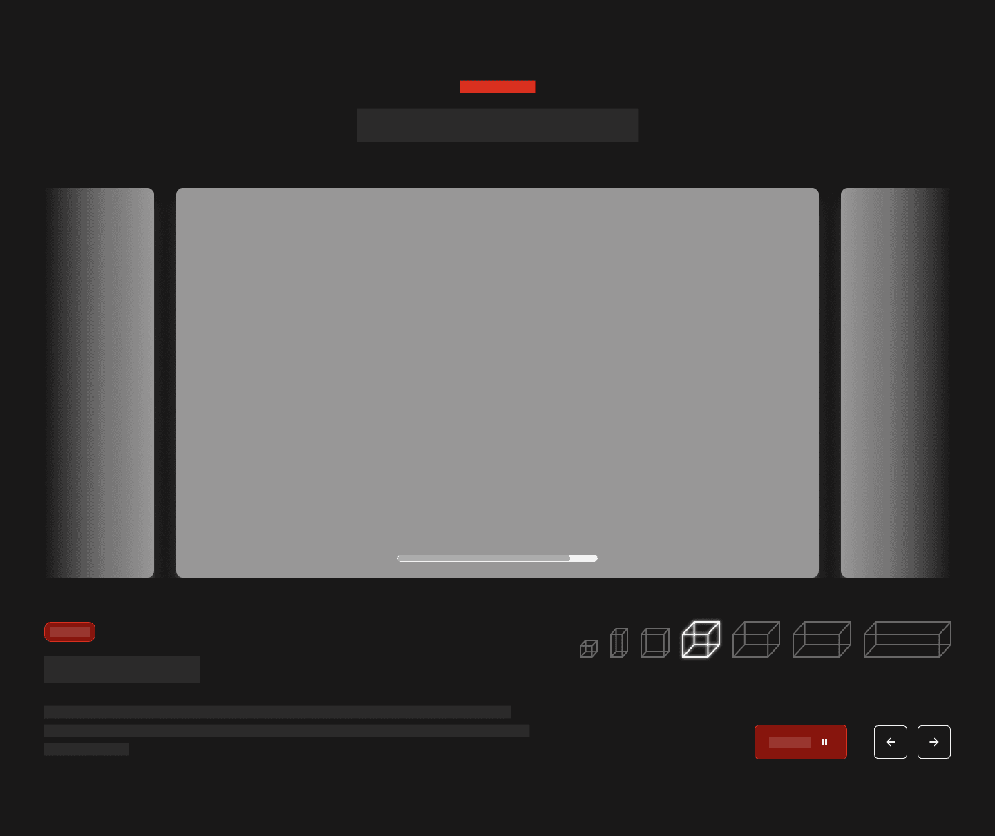
With this redesign, I streamlined how a user would find their size with a clear scannable flow: 1) watch the video, 2) read the dimensions in the title, 3) see additional sizes visually compared in the nav bar, then 4) read the body text for additional details.

THE Breakdown

Carousels for focused experiences

Carousels were common in our site redesign. So to condense the wealth of content in a familiar interaction, I used a carousel as a baseline. Not only do carousels have the flexibility to become non-cookie-cutter, the format helps users focus and explore content strategically.

Carousels were common in our site redesign. So to condense the wealth of content in a familiar interaction, I used a carousel as a baseline. Not only do carousels have the flexibility to become non-cookie-cutter, the format helps users focus and explore content strategically.

A visual and informative navigation

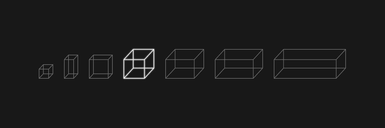
When I read 5” x 10” and 10” x 30,” I wished I knew what that meant visually.

So I did exactly that–I created icons to indicate the sizing options, which doubled as a navigation bar and tool to make visual comparisons.

After exploring a sizing option, users might think, “okay, I just need something maybe double this size,” then find an icon double in size. This makes finding the relevant size more intuitive and quick.

When I read 5” x 10” and 10” x 30,” I wished I knew what that meant visually.

So I did exactly that–I created icons to indicate the sizing options, which doubled as a navigation bar and tool to make visual comparisons.

After exploring a sizing option, users might think, “okay, I just need something maybe double this size,” and they look for an icon that is double in size. This makes finding the relevant size much quicker.

Clear hierarchy that guides users

The large video is the first focus, because it’s easiest to understand spatial information through video. Watching the video would remove the need to read the text, but reading the text might not do the same.

After watching the video, the user might want to read more or explore another size. Using proximity rules, grouping the sizing information on the left and global information on the right makes it clear where users should look for their next action.

Additionally, by making StorQuest’s recommended size (which is also the median size) the default, users only need to explore 3 more sizes at most.

A "Netflix" experience

I wanted to make this module immersive because it was an important user flow in the StorQuest site.


Our designs had mainly white and off-white backgrounds, so I used off-black to draw users out of their typical experience and invoke the feelings people get in a movie theater or netflix scrolling session–an experience that

feels inviting and personal.

The Outcomes

Breaking out of the"cookie-cutter" designs

I had the opportunity to present my designs during internal meetings and receive feedback. Although only a couple of these alternative designs were used or iterated upon, our agency's team was grateful for this extra initiative.

With these alternatives, the agency was able to maintain good relations with StorQuest, with StorQuest even expressing that they were grateful for the extra effort of providing a range of alternative designs.

The alternative size guide, which will be shipped!

Teamwork

Going the extra mile: Filling the cracks in a cross-functional team

With a small design team, we wear a lot of hats. I liked this because I could grow various skills, and my work attitude is very much “I want to take on more so I can learn.” So in addition to the original design work I was delegated, I also did the following:

Ensure usage of our StorQuest library/styles/etc.

I noticed that certain fonts, colors, and styles were linked to the wrong Figma library because of overlapping names between our Relume and StorQuest library. I combed through our file to fix all discrepancies. 

Quality checks on copy

While pasting in copy, I imagined being a user: Did this flow of content make sense? Is this information I want to know, or would something else be more helpful? While considering the pages holistically, I was able to provide helpful copywriting feedback to the team.

Present designs to copywriters, project managers, and developers.

I had the chance to present and receive multi-dimensional feedback for my designs in an internal review meeting with different experts.

Add to StorQuest’s design system

I created an icon guide that explained our standards for different icon stylings and the library of icons we used.

end Credits

The warmest thank yous

This was my first client project, and I learned so much! During the time Ashton (senior designer) and Candice (my manager) were on PTO, Kaheawai was like a workplace older brother—he made sure I was up to speed with the project, guided me through the Red Door design process, and gave me invaluable feedback and advice. He's an amazing designer!


If Kaheawai was my workplace brother, Ashton would be my workplace father. You know, like the warm and kind guy who is so casually funny yet incredibly skilled. I learned so much by just digging into his work on Figma and listening to his thought process. He was so encouraging of my work and I'm thankful I got to learn from him!


Lastly, the StorQuest team of devs, PMs, and creatives were such a pleasure to work with! I didn't realize how much cross-collaboration a website would require, and I was able to learn a little bit of everything because of the amazing collaboration at Red Door.